SOLARIS is being released today by The Criterion Collection in a new transfer on Blu-ray and DVD. I was honored to be asked to work on a new cover and package design for it; a dream-come-true assignment. Criterion didn't give me any major restrictions in re-visualizing Tarkovsky's science-fiction masterpiece, but an existing cover had grown stale and they wanted something fresh for the film's birth on Blu-ray. We looked at the fantastic Polish poster designed by Andrzej Bertrandt and loved its abstract futuristic imagery and its title treatment. But I also felt that this poster, and many others that had been made for the film, all but ignored the humanity and psychology of the film as it relates to its protagonist Kris and his lost wife Hari who lives in his memory and, it appears, on the space station orbiting the mysterious planet Solaris. This is the core of Tarkovsky's film, and what separates it from so many other classic science fiction films, and we wanted to focus on this while remaining open to other visual possibilities. And I loved the idea of making Hari, rather than Kris (the protagonist), the icon for the re-design.
The first step in the design process is always to watch or re-watch the film. Solaris is a film I had already spent a good amount of time with, a film that has only grown more interesting each time I've seen it. Watching it again from a design perspective, I took notes on themes, concepts and imagery that I wanted to focus on and frame grabs that I might want to use, and also revisited some of his other films, interviews and commentaries just to sink myself into the world of Tarkovsky. My instinct was to start with a few key visual ideas and explore from there: Hari (a haunting shot from her entrance into the film seemed like it would work as a striking icon), an ocean background (nature is an important character in Solaris and I wanted to focus on this), a circular motif suggesting both the planet and a psychological hole/portal, and a hand-written title treatment representing the film's humanity over the cold, clean aesthetic associated with most science-fiction films. Many variations followed:
While we let those ideas sink in, I continued to run with some other rough ideas and experiments, throwing everything to the wall and seeing what stuck. With a film as visually rich as this, it was easy to be inspired and play, and I knew that it was going to take a lot of exploration to arrive at the perfect cover.
These below incorporate a photograph I had taken of a wet and rusty metal dish at my dad's house in the country; I thought it would make for a great planet icon. These were a bit thin conceptually, not really tapping into the humanity I wanted to convey, but I'm fond of them from a purely graphic standpoint.
Above, another purely graphic approach using the rusted dish. Inspired constantly by the great Czech and Polish poster artists, I always like trying messy, abstract concepts that don't use any film imagery at all, just to see if they might work, to see how abstract a cover we could possibly get away with. But for a film photographed this beautifully, it was a hard thought to forgo any actual images from the film in the design; some kind of photo montage was feeling like the best possible tribute we could pay to the beauty of the film. Next came a few more experiments trying a Futura title treatment and a Kris-centric cover:
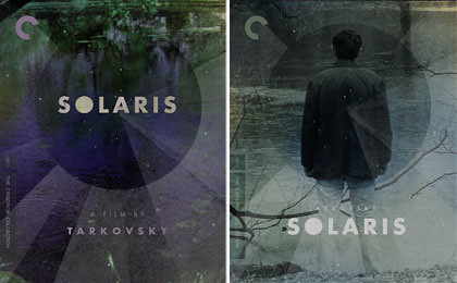
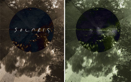
With all of these covers thrown about the virtual table, the image that Criterion wanted me to come back to and work with was of the ghostly Hari, and they liked this comp in which I flipped an image from the film upside down, switching the assumed roles of the pictured reflection in the water and the actual photographed embankment. Reflection being such a huge theme in the film, this made sense to me as a visual trick and I liked the haunting quality of the reflected trees fading up and melting away into the space above:
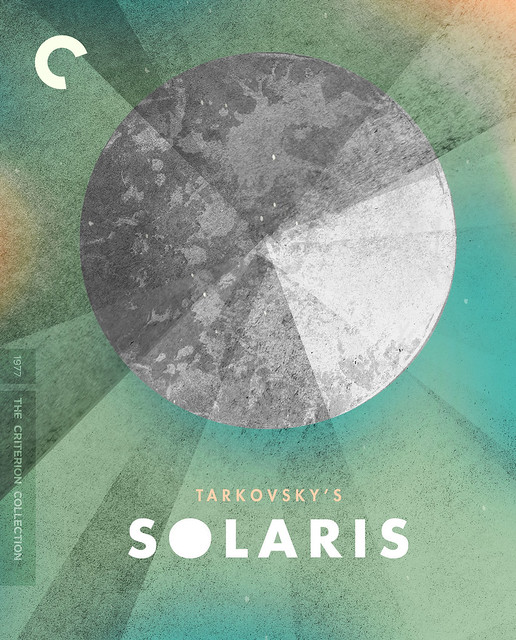
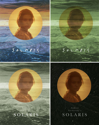
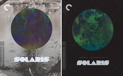
Meanwhile, with a cover moving in this direction we thought a more genre-specific title treatment might make sense. I made an original title treatment that would serve as a kind of rebranded logo. I also thought it would also look nice reflected under itself, on top of whatever background we had to work with. I threw together a few simple cover concepts to try the new title treatment, including a simple-as-it-gets "planet in outer space" concept that checked-in with those original Polish posters. These also demonstrate a fixation I was enjoying with a contrast between a black-and-white background (representing Earth/nature) and a circular planet/gateway filled with color.

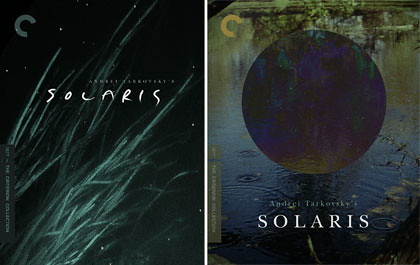
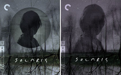
Switching back to the "reflection" comp... the colors in this framegrab came across as too dull and murky, and with the dark shadow of Hari this was starting to look like just a dreary ghost story. It was suggested that I try to incorporate some of the planet's vivid colors that we see in the film's later sequences, which led me to a comp that would be closer to our final cover but still not right, looking a bit hellish:
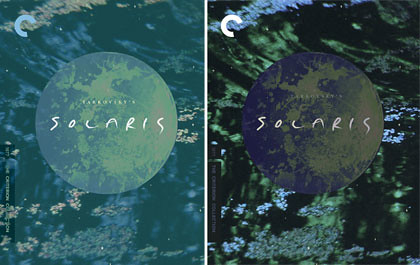
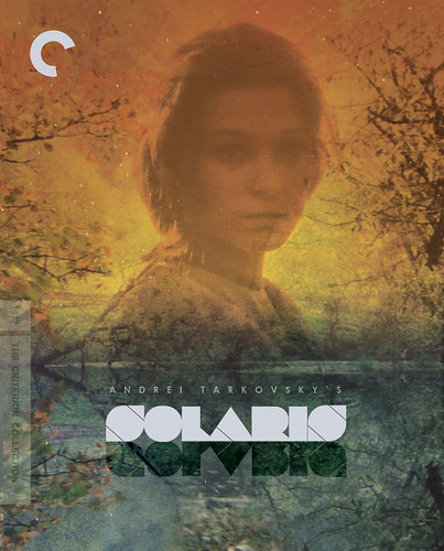
I went to another film still that would provide some nice reflected imagery and came up with this comp that I still like, but that seemed a little too busy. Here I also started to lighten Hari's face to bring some humanity to the image rather than just a ghostly shadow. At this point you can see the final cover taking shape comp by comp...
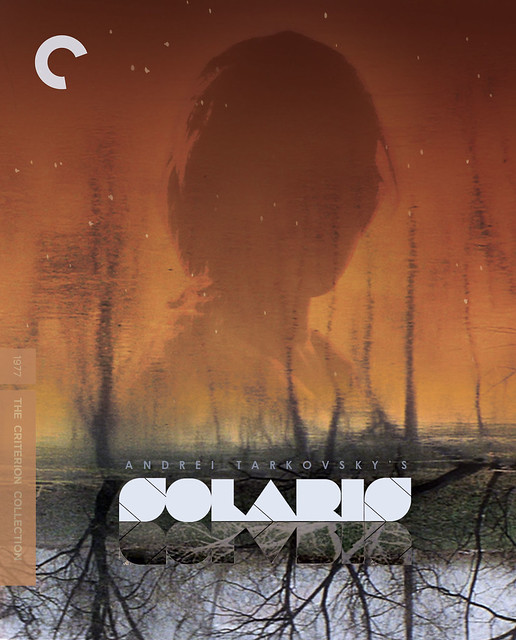
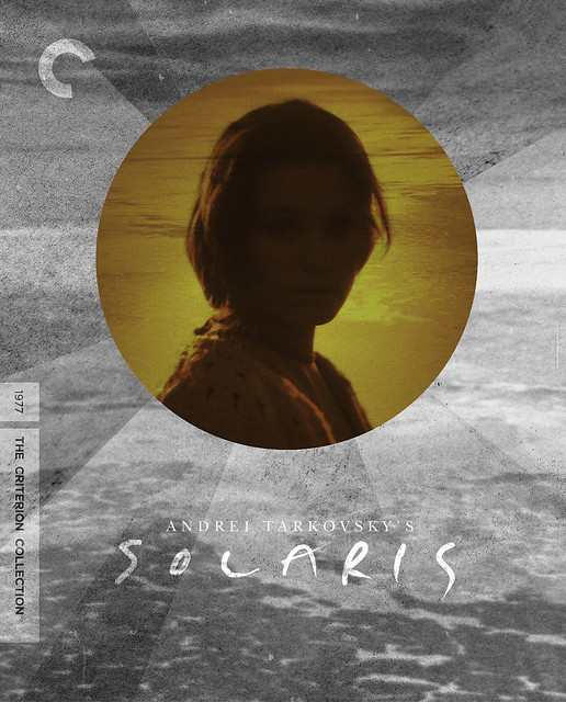
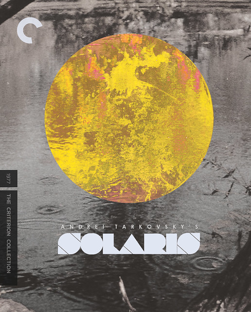
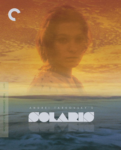
From here I returned to one of the first stills I worked with and the first comp I came up with. I applied the flipped-reflection treatment to that ocean still, along with a complete color-overhaul that encompassed a larger spectrum of the planet's look. This image of Solaris' ocean is one of the most beautiful in the film and from the beginning had such potential; flipping it upside down provided a thematic and visual solution (creating negative space for Hari at the top and center of the frame), and after trying so many things in other comps, I was able to return to this background image, apply what I'd learned, add the new title treatment, and finish it up. The approved final cover achieves what we were hoping for-- an elegant and seductive re-design that paid tribute to the psychology and visual beauty of Tarkovsky's film-- and hopefully it does it justice.
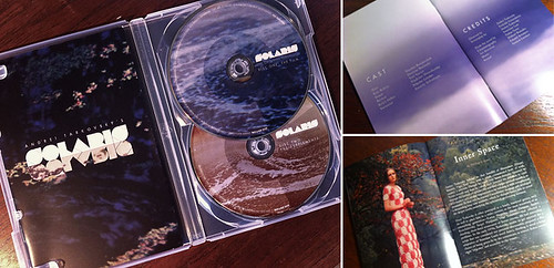
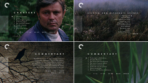
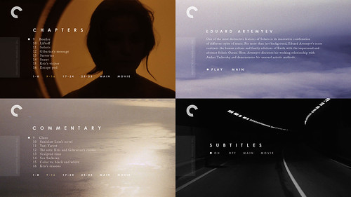
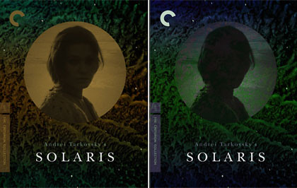
The rest of the package was a joy to assemble. Without any pressure to over-design Solaris as a sci-fi movie, I simply plucked the images that I love and seemed strongest thematically, and let Tarkovsky's own visual beauty do most of the work. My goal was for the package and menus to feel elegant, human, and warm. Here are a few peeks at how the booklet and DVD menus ended up looking:
Thanks for reading, and thanks of course to everyone at Criterion for this dream assignment. And I hope anyone reading this will enjoy discovering or re-discovering this sci-fi classic by one of the world's master filmmakers, another of which is coming just around the corner from Janus Films...