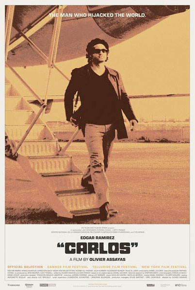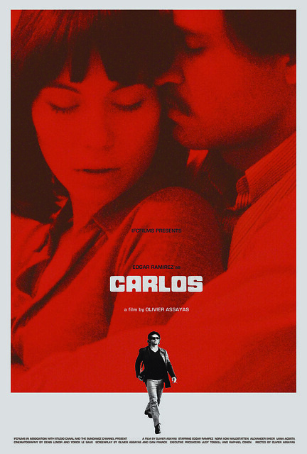
Olivier Assayas' epic international thriller CARLOS is set to open this weekend at Nashville's historic Belcourt Theatre, one stop on a roadshow around the country that isn't to be missed. I was honored to design the theatrical poster for IFC, and the process was rather brief. Thematically, we wanted to capitalize on this idea of Carlos as an iconic celebrity, with as much danger and sexiness embedded into the presentation as possible. Stylistically, I looked to the posters for various international thrillers of the late 60's and 70's, with their prominent taglines and quotes, bold fields of color and borders... a style outlined very well by Adrian Curry in this Movie Poster of the Week piece. I hoped to capture this same spirit without getting too campy, referential or ironic, and create a poster that felt vintage but also contemporary.
I went right to this shot of Carlos walking off a plane in his signature outfit, half-reaching for a bag on his shoulder containing who knows what kind of dangerous weapons... He's walking with supreme baddass confidence, he's obviously been jet setting around, and he's on a mission. It was perfect for how I wanted to present Carlos and how I think Assayas wanted to present the character in the film. I initially tried it black and white with a little blue, one where the whole poster was yellow with shades of red and orange, and then various versions with white backgrounds and different color schemes on top of Carlos (we ultimately liked the orange one the best). Below I've posted an alternate poster concept I worked on for a little while before setting on the final poster. The title treatment seen in both posters is a modified version of Fat Albert inspired by the SERPICO poster/typeface, and I used Eurostile for all of the billing.
I went right to this shot of Carlos walking off a plane in his signature outfit, half-reaching for a bag on his shoulder containing who knows what kind of dangerous weapons... He's walking with supreme baddass confidence, he's obviously been jet setting around, and he's on a mission. It was perfect for how I wanted to present Carlos and how I think Assayas wanted to present the character in the film. I initially tried it black and white with a little blue, one where the whole poster was yellow with shades of red and orange, and then various versions with white backgrounds and different color schemes on top of Carlos (we ultimately liked the orange one the best). Below I've posted an alternate poster concept I worked on for a little while before setting on the final poster. The title treatment seen in both posters is a modified version of Fat Albert inspired by the SERPICO poster/typeface, and I used Eurostile for all of the billing.

The special roadshow edition of CARLOS plays this weekend at the Belcourt Theatre in Nashville, where you can also pick up a limited edition program guide that I designed. Read the Scene's interview with Assayas here. Thanks again to everyone at IFC!

No comments:
Post a Comment