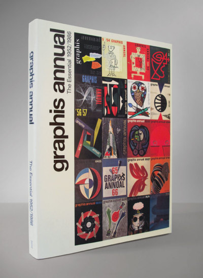
If you're like me, you know that all you need for limitless design inspiration can be found in any Graphis Annuals ranging from the early 50's to the early 80's. You have obsessively sought out copies of any of these annuals, maybe collecting even whole decades and periods, and spent an embarassing amount of money in the process. If you're smarter than me, you've waited for the release of this book, which collects highlights from these annuals' greatest years and presents them in their original page layouts (like the originals, some designs are in color and some in black-and-white), for one good price. A great gift for young and old design lovers, an amazing reference and resource, this has gotta be one of the essential design books available, a must have. Here's where you can get one.
8.29.2011
8.28.2011
CHILDRENS BOOKSHELF: Wacky Pohadke
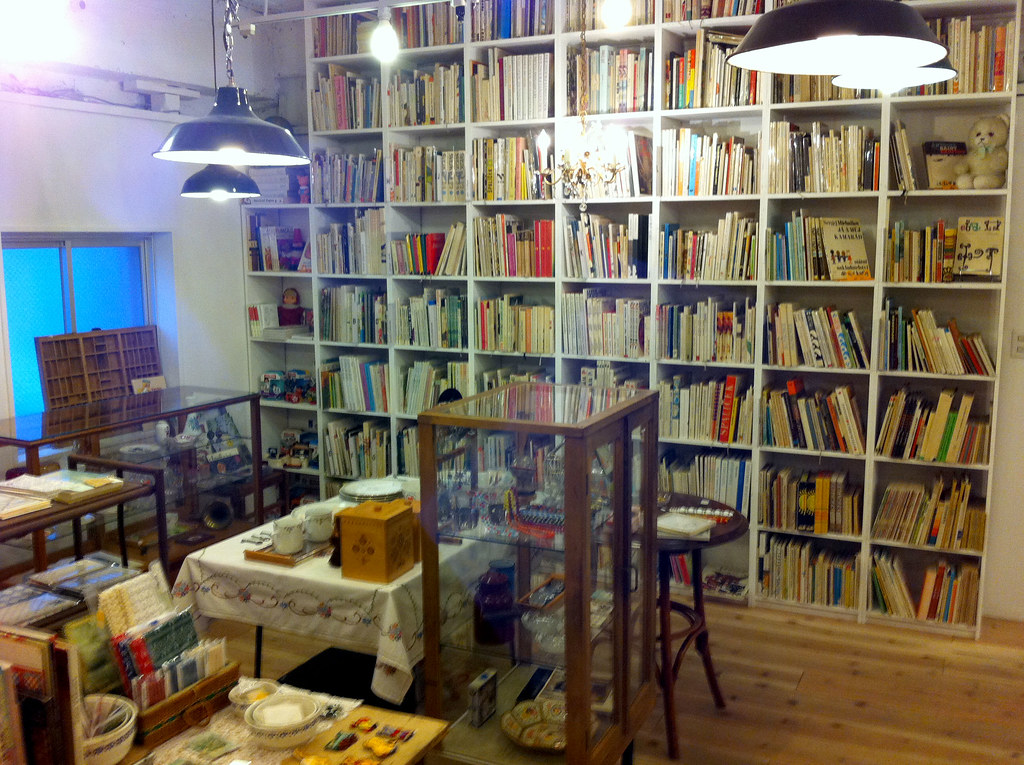
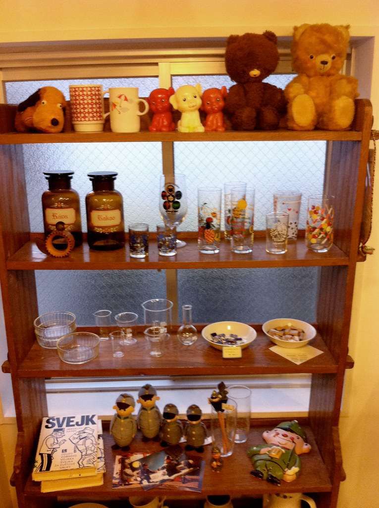
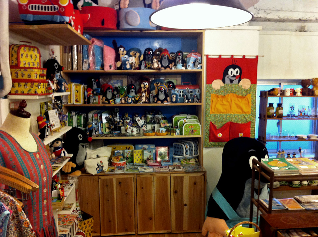
I'm thrilled to have sent a guest post over to my favorite art site on the net, 50 Watts, highlighting one of my favorite recent book finds. I found this at Cedok, an adorable book and zakka shop hidden around Akihabara in Tokyo (I had to ask a few locals before I found the entryway leading up to the 2nd floor location). On all levels, it's one of the most amazing and beautiful shops I've ever visited in my life. The kind Japanese owner and his wife were quite surprised to see a young white guy with a backpack coming in looking specifically for vintage and strange Czech childrens books. Thankfully this was their specialty, and we got on splendidly. His first recommendation from his incredible collection was this title, Prastene Pohadke illustrated by Bohumil Stepan (translates to something like Wacky Fairy Tales), and that if I were to only buy one book it should be this one (I bought many, and even got an extra thrown in after putting the owner on the list for my show in Tokyo... gotta love a good barter). To see more Wacky Pohadke visit Will Schofield's 50 Watts.
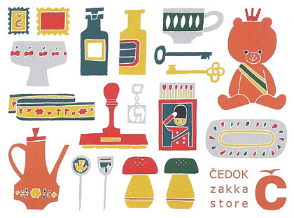
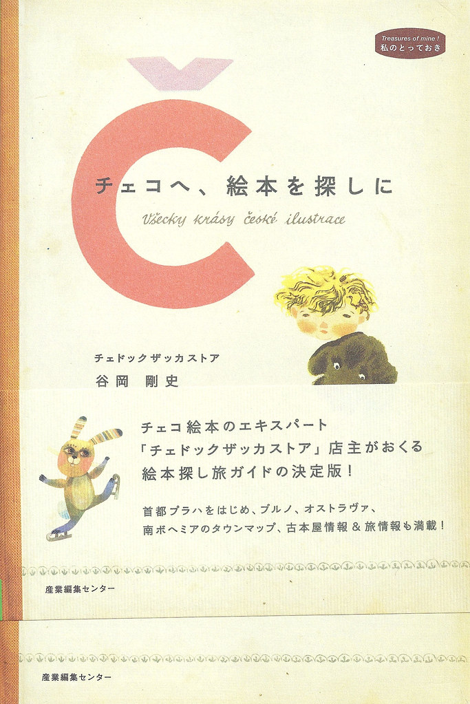
On this night I ran to find an ATM six blocks away before the shop closed, then wore out my feet and body in Akihabara's vast electronic and toy mecca until it all shut down, with treasures from Cedok on my back. Below, Cedok's card , some pictures from inside the shop, and the cover of the owner's impressive and beautifully designed book on the history of Czech illustrators, bookshops and popular childrens characters. Thank you so much to the owners of Cedok for sharing these treasures with us. Visit them if you can, and in the meantime follow Cedok on Twitter and visit their official Japanese sites for books and zakka.
Labels:
50 watts,
children's bookshelf,
czech books,
czech posters,
fairy tales,
japan,
zakka
8.27.2011
SATURDAY EVENING POSTER
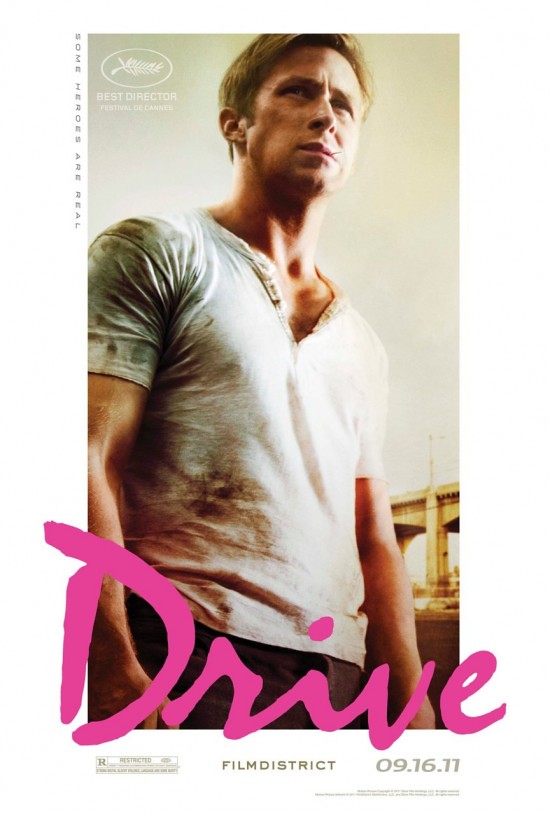
I wish all Hollywood movies sounded as tantalizing as DRIVE, an upcoming movie directed by Nicolas Winding Refn, starring Ryan Gosling and Carey Mulligan, and described by some who have seen it as an "art house action movie..." Easy to please, I love this poster for three reasons: its focus on man-crush hall-of-famer Ryan Gosling, plus the combined white border and the retro pop splash of the pink scripted title treatment.
Labels:
drive,
ryan gosling,
saturday evening poster
8.26.2011
MARIA HOLMER DAHLGREN + IKEA
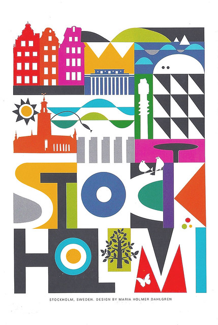
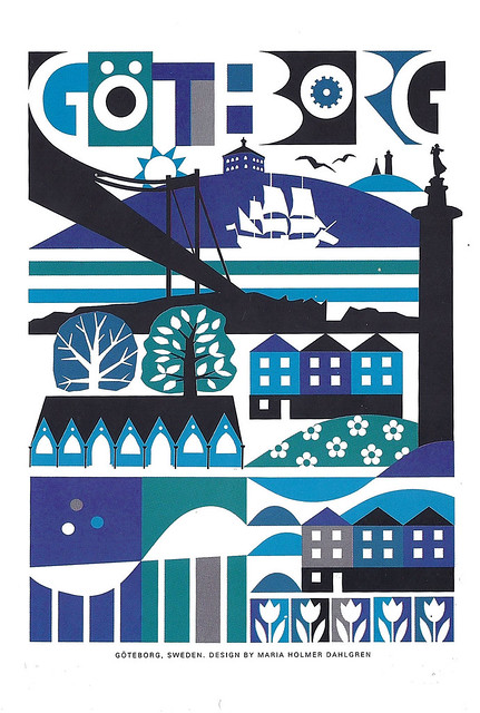
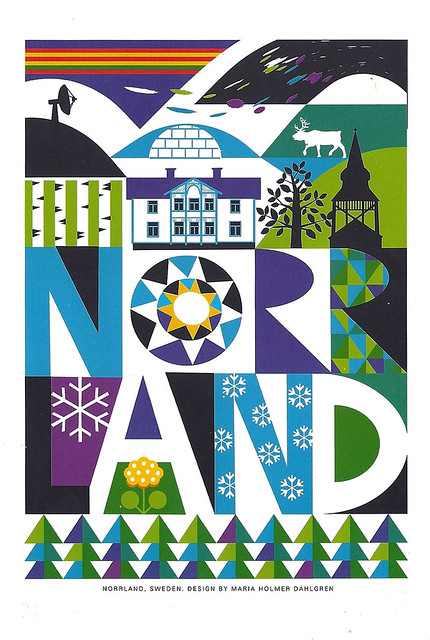
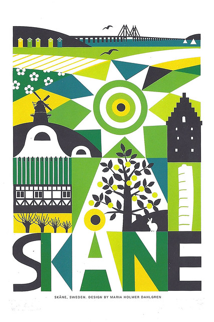
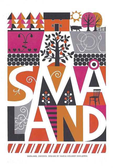
As a lover of design and all things visual, I am constantly bookmarking images I love, buying book covers to collect, looking at posters online, but rarely does something I see stop me in my tracks completely as did these postcards by Swedish designer Maria Holmer Dahlgren. Images so perfectly composed, colored and realized that you wish you had made them, so miniature and perfect that you wish you could enlarge and frame them on your wall, so imaginative that you feel like you're traveling through Sweden in your daydreams. These designs are simply perfect to me, everything I could hope for in a collectible Swedish postcard set. Now they are just one more reason to visit your regional IKEA, besides the Expedit shelves, elderberry syrup and cinnamon rolls. Here are the five designs commissioned for their postcard pack, and here's where you can read more about Maria, which is what I'm about to do myself, before planning which of these places to visit first:
Labels:
ikea,
maria holmer dahlgren,
sweden
8.22.2011
Children's Bookshelf: SHIGERU MIWA
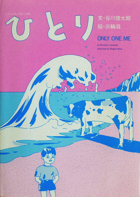
For the first in a number of posts sharing some of the strange and pretty books I picked up on my travels this year, I have chosen one of my favorites: Only One Me, a beautiful and surreal children's book written by poet Shuntaro Tanikawa and illustrated by Shigeru Miwa, published by Balloon-sha. I can't find much info about the creator of these great illustrations, but the inside flap of the book teases with thumbnails of three other tantalizing titles by Miwa: It's really like this--, Why don't they ever ask me, and Grandma-- another duo-tone picture which according to Steven Heller's Design Literacy explores a child's emotions observing Alzheimer's disease, a more taboo and personal topic for Japanese children's books. Below I'm posting some extremely crude shots of some of my favorite pages of Only One Me, which you may click to enlarge.
UPDATED: My friend Yasushi has just schooled me on Shuntaro Tanikawa, informing me that not only is he, now over 70 years old, one of the most well-known Japanese poets, but he also wrote both the original "Astro Boy" theme lyrics and co-wrote the screenplay for Kon Ichikawa's film "Tokyo Olympiad." In addition to publishing plentiful books of poetry and children's books he also translated "Peanuts" into Japanese. Wow. Thanks Yasushi!
Labels:
children's bookshelf,
japan,
shigeru miwa
8.20.2011
SATURDAY EVENING POSTER
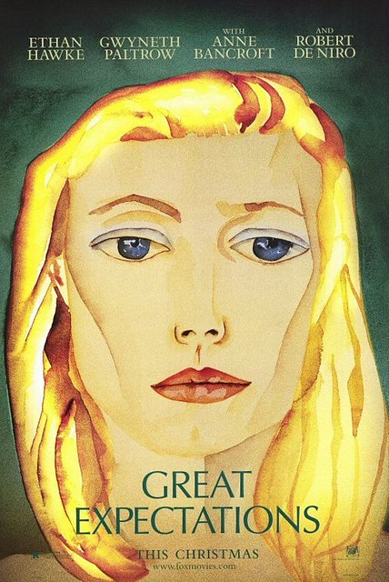
Here's one of my favorite posters from 1998, a time when I was really falling in love with film, and Alfonso Cuaron's beautiful adaptation of GREAT EXPECTATIONS became (and still remains) an underrated favorite of mine. This teaser poster, which I still remember seeing in the Lion's Head theater lobby, stars not young star Gwyneth Paltrow, but Francesco Clemente's beautiful painted portrait of her, one of over 200 pieces that Clemente painted for the film as stand-ins for the artwork of Ethan Hawke's Finn. As a teaser, it foreshadows Cuaron's lush color palette, all overgrown greens and golden hair. I loved the studio's decision to market this Christmas release with this painting alone. See more of Clemente's work as it is integrated perfectly into the film and its credits sequences, and more of his work here.
8.19.2011
BOOKS!
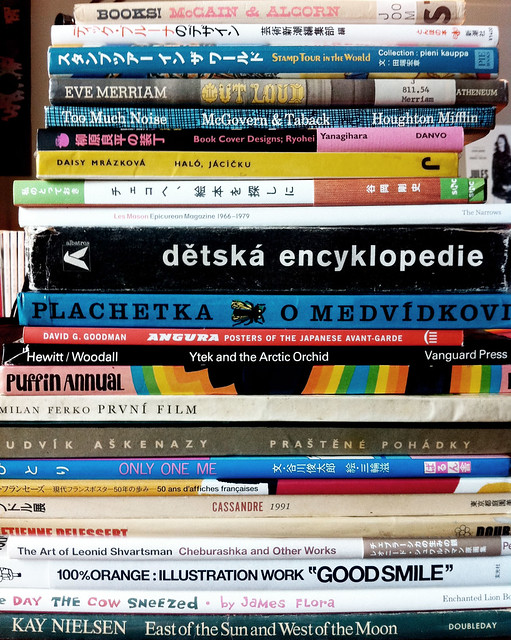
New book finds from Japan, here and there, to photograph soon and share...
Labels:
children's bookshelf,
design bookshelf,
japan
8.13.2011
MARIO WORLD
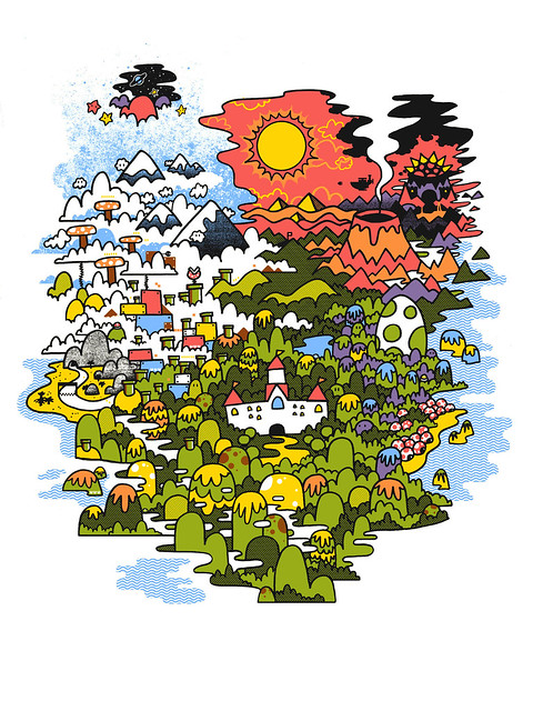
I made this piece for Gallery 1988's upcoming video-game themed art show paying tribute to the greatest Nintendo classics. It's my tribute to the original Super Mario Brothers game, the Mushroom Kingdom, and everything that came after that on our consoles and in our imaginations. Click the image to enlarge it and see some of the details; there are some hidden things here and there that Mario experts will be able to spot. This will soon become an 18x24" screenprint courtesy of the wizards at Burlesque of North America, the design and print company of my old Nashville friend (and one of my favorite artists) Mike Davis. Prints will be available at the show in late September and through Gallery1988, and a limited amount may be available here through my site. Stay tuned for more info!
Labels:
burlesque,
gallery1988,
mario,
mike davis,
mushroom kingdom,
nintendo,
prints,
screenprints
8.03.2011
Process: WORLD ON A WIRE
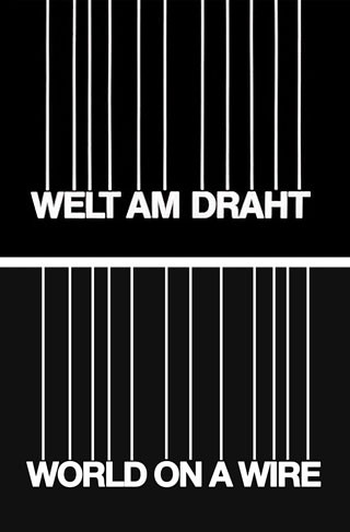
As Fassbinder's newly-rediscovered sci-fi opus WORLD ON A WIRE makes its rounds in US theaters, I thought I'd share a few steps in the poster design process. I was honored to have Janus Films ask me to work on this exciting project, and it ended up being a tricky journey from complexity to minimalism. After watching the 2-part film, the first step was obvious: convert the iconic original title treatment into English. After incorrectly assuming that the typeface was a form of Helvetica, a little detective work identified it as an out-of-print version of Akzidenz Grotesk, the typeface that branded the famous and iconic Marber Penguin covers. I knew off the bat that these white lines could be a great graphic starting point for my design.
I felt that we should present WORLD ON A WIRE as a kind of event movie for its target audience: lovers of international cinema, science-fiction and the avant garde. For some reason at the time-- likely my infatuation with the complex, detail-filled Mondo screenprints designed by the likes of Tyler Stout and Ken Taylor-- my initial instinct was to create something epic in scope and volume, filled with sci-fi imagery and digital abstractions, with a retro 70's frame. This resulted in the rough comp below:
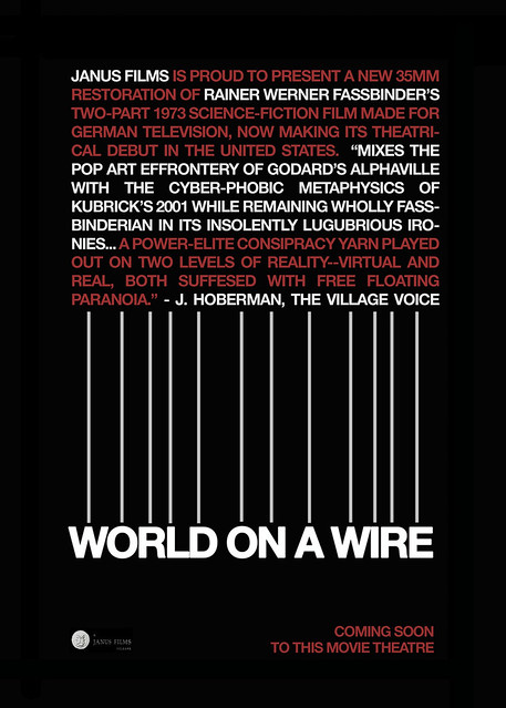
Meanwhile, I came up with this idea for a teaser poster that could trumpet the arrival of the film as an event...
...and, in the interest of additional options, this quad-style teaser poster that typographically suggested the film's worlds-within-worlds theme:
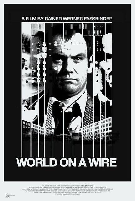
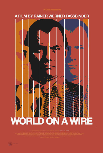
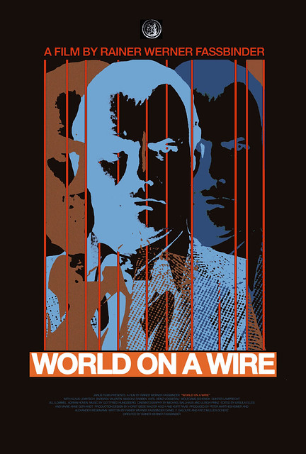
Janus liked my use of the white lines of the title treatment as a both a graphic element and a suggestion of the film's multiple layers of reality, but after sitting on it for a while we started to think it was too complex, too cold. I felt I just went overboard... I didn't like it. I sent them this next idea, switching the main color field to the red background of the film's credits, and simplifying the concept to something more graphic and minimal. The hero's face would be broken up and delayed through the white lines as his identity in the film is fractured through multiple realities:
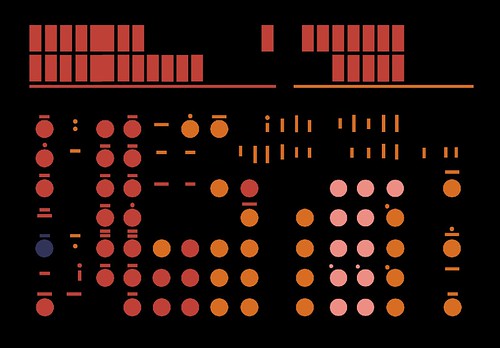
(The below image, which I made based on a shot of a computer panel in the film, was integrated as a background pattern for many of these comps... The dials and panels could, I thought, help remind viewers of the sci-fi genre):
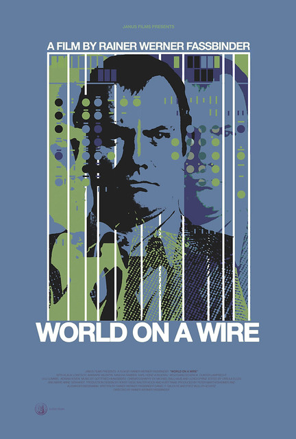
A couple other variations on the same concept:
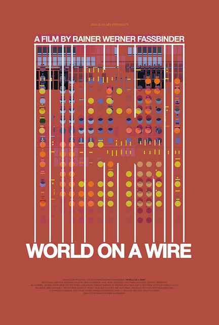
And a no-good, too-abstract pattern-only variation...
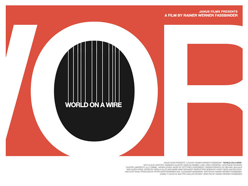
Janus loved these color schemes, but we still felt like we hadn't nailed it. We wondered if we even needed the hero's face at all... if we could convey the concept of alternate worlds and multiple realities with an even simpler iconic image. They pointed to my posters for Before Sunrise and Before Sunset as examples, and I was happy to indulge in such a liberating guideline. Kind of the opposite of a studio telling you that they want all the actors' heads big and large across the poster, this is the kind of direction from their client that a designer dreams of. I started with this simple overlay of two circles, a vertical representation of multiple realities:
...and the rest presented itself almost instantaneously. The overlapping shape would become a watchful eye, a sinister symbol of control; within the target of that eye we would see our hero running for his life, and from that eye would hang the puppet strings holding the title, suggesting an invisible manipulating force. The lines from the title treatment could continue upwards and suggest a modern cityscape. I went back to black for the dominant background color and had fun coloring the rest in a way that resembled the look of the film, but with a little more vibrancy and play.
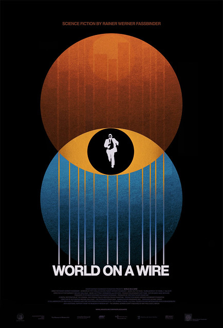
I was really happy with the result and Janus approved it without any further suggestions. Of everything I've done, this piece was probably most inspired by my dad's artwork, which he would often execute by hand with skillful airbrushing techniques. I'm very proud of this one, but the coolest thing about it is that a studio like Janus was willing and happy to take a purely graphic approach to a theatrical poster for an important release. We hope it seduces viewers into Fassbinder's newly-rediscovered world(s)...
Poster for sale in the Criterion shop.
Janus Films presents WORLD ON A WIRE
Art direction: Sarah Habibi
Trailer (long version) edited by Damon Packard
Labels:
janus films,
movie posters,
process,
sci-fi,
world on a wire
Subscribe to:
Posts (Atom)