
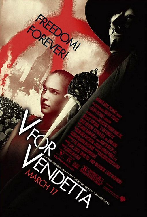
5. V FOR VENDETTA
Producer Joel Silver and art director Ron Michelson were sparked with this idea after purusing the Russian Boshevik-era posters at the Tate Gallery in London. ''I wanted people to feel as if the posters came directly from the movie,'' Silver said. ''If we were actually going to mount a revolution here, what would the imagery look like?'' So the axis is skewed, the color palette is stripped to shades of red, black and tan, and the credit block becomes a design element itself. If only all movie posters could stand on their own like so, and feel so closely connected to their film's tone and content.

4. NACHO LIBRE
Perhaps this is just an excuse for me to plug a movie I loved that most people didn't. But the poster is just like the movie: you'll love it if you love Jack Black. This poster shows you exactly what you're in for, and it tells the uninterested to keep moving along. It's really perfect.
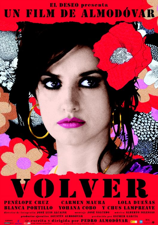
3. VOLVER
According to the poster for the new Pedro Almodovar film, the only thing you need to know about VOLVER is that it stars Penelope Cruz, and that she's lovely. And that pretty much is all you need to know. The cartoony flowers, in simple, bold colors and varied patterns, perfectly suit Almodovar's almost magical style. I just love this artwork, that's all there is to it.

2. LITTLE MISS SUNSHINE
Say what you will about the year's most talked-about Little Indie Film That Could, but you've gotta give it credit for having its visual template locked in: make everything yellow. I love the negative space, the simple font, and the picture, which playfully piques your curiosity if you don't know the premise. Rumor has it that the movie's press packets include yellow toy Volkswagen buses: now that's good marketing. And I want one for my toy collection.

1. THE GOOD GERMAN
No surprise here. The poster for Steven Soderbergh's Post-WWII murder mystery pays a direct homage to this CASABLANCA poster from the 40's.
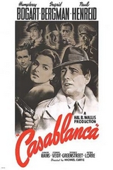 It lifts the curved, painted lettering of the title, the top marquee, the faded montage of supporting characters, and creates a border out of a crumbling landscape. By adding a deep red wash behind Clooney and Blanchett, and adding a tagline, the poster seems both antique and contemporary; I would've liked them to go all the way with a painted portrait. Still, this poster isn't a postmodern gimmick, it's just more gorgeous and eye-catching than any other posters in the multiplex.
Compiling this list was a little harder than I expected. So I'll leave you with a few other 2006 posters that caught my eye. Many times a movie's alternate poster -- one released by the studio secondarily, after a more formulaic one-sheet -- is more interesting, as seen below. Because, of course, average moviegoers can't digest interesting or experimental posters. Thanks for reading, and let me know what posters you liked this year.


76 comments:
Samwise,
the BRICK one sheet you have, I can assure you did not come from the Focus team in the US. I'm almost 100% sure that its an international one you're showcasing.
Good choices. I was a fan of the HALF NELSON one-sheet, but that is very misleading about the film's tone.
But, my favorite (other than THE GOOD GERMAN) might have to be the Alex Ross-inspired final one-sheet for SUPERMAN RETURNS -- the one where we have Supes looking over the world from far above. I didn't see the movie, but that piece of art was awe-inspiring.
Jason,
I'm sure it is an international version. Just like movie trailers and book covers... international versions are almost ALWAYS better. I just don't get it. It's like they actually think Americans need things to be more dumbed down.
That said, the US BRICK posters are still pretty cool.
nice work samwise! i've always liked your graphic and design style, and i can the influences in this post. well done.
Nice collection, Sam. All your choices are great, but I'm especially behind number 5 (the first one-sheet I've actually bought in years, number 4 (for every reason you stated), number 3 (why is she so beautiful in Almodovar movies and, to my eye, so ordinary everywhere else I've seen her?) and number 1, a poster which might be, if early reports are at all believable, better than the movie itself.
This is my first visit to your site (I discovered it through Green Cine Daily, of course), and I'd like to take this opportunity to invite you to come over to my site, take the quiz and tell your friends! Thanks again for your great post.
Nice list, I need to get a Little Miss Sunshine poster for my apartment.
The Vendetta poster was inspired by Bolshevik posters?? Who knew. (I'd throw in a catchy Russian phrase but no one would get it.)With Bolshevik-inspired movie posters around, it seems that I just cannot escape Russian/Soviet history, art, language, etc. Nothing that a few months in Spain can't cure, I guess, where I'll have ready access to all the "better" international versions of everything.
Thanks Natey, Dennis, Adrian, and Mallory.
Dennis -- I'm embarking on your epic quiz as we speak.
Adrian -- you have an apartment??
I will come January.
Hi everyone!
That BRICK poster is actually the poster used for publicity at Sundance.
The US posters were pretty good, but the International version was spectacular (IMO).
See it here: http://www.filmfocus.co.uk/newsdetail.asp?NewsID=715
I'm an independent exhibitor and thought I would mention that the Brick poster noted here (and I agree that it is terrific) is the first set, or teaser one-sheet, that we received from FOCUS. We ultimately had the whole series, but this was the first. Cheers.
The Hard Candy poster blows all the others out of the water. It's the single best poster I have ever seen.
The inside man should have been in there for sure, way better than nacho libre
Hey, where's Snakes on a Plane!!
Thanks Donnie, anon, and Jason for the info about the BRICK poster.
Ronnie, perhaps a 2006 album cover list might be next!
Martin, that's some strong language on HARD CANDY poster, but I do love it! I love me some fairy tale references, ala the Little Red Riding Hood seen here!
As for INSIDE MAN, that poster did indeed have a cool layout. But I couldn't have hated the SNAKES ON A PLANE artwork more; It looked like it was done by a highschooler in Microsoft Paint!
I did expect to see Perfume on there, I must admit: http://www.flickr.com/photos/heilemann/266954995/in/set-613088/
I like:
1) Nacho Libre: Good use of type and colour
2) Little Miss Sunshine: Nice modern retro look
3) Brick: Plain good suspense design
4) WTC: for the iconic value which the poster captures
5) The Prestige: just a sucker for retro so
Loved your choices, especially Volver. I liked the poster from Little Children.
It's a shame the poster for V For Vendetta was better than the movie.
Snakes on a Plane didn't make the cut? Darn!
The interesting thing about the "Good German" poster is that it actually helps you 'get' what's going on in the film.
The interesting thing about the "Good German" poster is that it actually helps you 'get' what's going on in the film.
I really liked the poster to The Black Dahlia - great bit of Artwork.
But I have to agree with Nacho Libre - great film - great poster.
(great blog)
(did I say Great enough?)
Great!
You forgot the best posters,V for Vendetta was it,but what about THE FOUNTAIN,A SCANNER DARKLY (the coolest of them all),SUPERMAN RETURNS (where he's on top of the globe and you see him from head on),and heck more that were better than your selection.
Those are all great posters, but where's the recognition for RUNNING WITH SCISSORS? (The legs running, attached to the hand carrying the scissors.) It's a very creative, clever poster that could be overlooked due to its silliness factor, but that doesn't diminish the genius of, what i think should most definitely be in the top 5 posters of this year.
Good selection. Congrats.
No love for THE FOUNTAIN? COME ON!
THE FOUNTAIN poster is nice, but it more or less just cribs imagery from the movie's scenes. I imagine there could've been a much cooler idea there that really integrated all three stories in a more interesting way.
All good suggestions, and thanks for the comments!
I should add that I just recieved one of my Top Five posters in the mail to actually own for my wall -- Thanks for the VOLVER one-sheet, Casabla!
Before I fell in love with movies, I fell in love with movie posters. Great list, though I would have included the poster for "Letters from Iwo Jima" in place of, perhaps, "Volver."
How about the best trailers? I could also say best tag lines, but there no longer seem to be any really good ones.
Nice idea and nice list. Movie Poster art is too often overlooked by the fact that it's, ultimately, trying to sell you something.
I loved the V for Vendetta, Volver, and Little Miss Sunshine posters too!
I was surprised not to see the "Superman Returns" regular release. It was a nice piece of art (that I currently have on the wall.)
Also, I probably would have put one of the "Casino Royale" prints. I thought the advance was nifty.
I really liked the "Brick" print though. I have the regular release print, but that Sundance print really picks up on the noir aspect of the film. Cheers.
Good work, I still love the "morphing" Spider-man 3 poster.
LOVE the V for Vendetta poster, almost liked the second one better, the one with his blades making the V shape and V himself at the top and a "sea of V's" behind him. I saw it when I bought my speical edition of the film. I LOVE that Prestige poster, very cool. Thanks for this, I'm a HUGE movie poster fan!!!
Good topic, Sam. I like all of your choices (although I can't go with you on Nacho Libre; sorry, buddy). Another poster that I thought was pretty good this year was The Devil Wears Prada. I like the simplicity of it.
http://www.impawards.com/2006/devil_wears_prada.html
I also liked the poster to Eastwood's Flags of Our Fathers because I anticipated (having seen the trailer beforehand) that the poster would make prominent use of the famous photographic image about which the story is concerned. When I saw the poster, however, I noticed how small (and almost insignificant) it was compared to the poster's size. I later thought that decision was very appropriate because the film is about so much more than just that one image/moment.
http://www.impawards.com/2006/flags_of_our_fathers.html
I'm sure you've already thought about (or done) this topic, but what about the worst movie posters of the year?
So Soderbergh once again gets kudos for regurgitating the work of others.
I think Superman returns poster is awesome and it should be in the top 5. The poster he is looking over the earth in space. Superman Poster #1 !!!!
Dave Chapelle's "Block Party" is my favorite. It feels like it's literally jumping out at you.
The Twin Towers against the vivid Blue is also stunning.
I echo the sentiment above that Penelope Cruz looks quite ordinary when I see her everywhere else, yet much more lovely here.
The Fountain all the way.
I have no problem with putting Nacho Libre there, but your order seems weird. you seem to like V For Vendetta the most (as it is the best one), yet you put it behind Nacho. I'm confused.
I'm glad to see V for Vendetta on there. But I'm really disappointed that Perfume didn't make the cut.
Here's another vote for the Casino Royal poster. No explosions, half naked babes, or phallic gun barrels. Just a lovely understated photo with a touch of menace. Brilliant.
A good choice in general, apart from one curious omission:
"Tideland" is definitely one of the posters of the year for me.
Fairytale and nightmarish in equal parts, and with Terry Gilliam's name in prominent view, it (to quote the "Nacho Libre" comment)shows you exactly what you're in for, and it tells the uninterested to keep moving along.
In that case, an open invitation to Gilliam fans.
The Good German? I cringe every time I see that poster, it's too similar to Casablanca for me. It's one thing to homage the poster, but this is more of a complete recreation/rip-off. It takes away from the original.
I really like the "Little Children" poster. It's sexy and haunting at the same time.
Great list.
The only ones I didn't like were Nacho Libre, World Trade Center and The Prestige
LOVE The Illusionist one-sheet. When I first saw the "secondary" posters you had that weren't so "dumbed down", I was beginning to think I had already seen them, then I saw that, which I thought was REALLY cool. I love how it reminds me of like a western wanted poster.
Also, the Brick one is pretty cool, even though I HATEHATEHATEHATED that movie. The Prestige one is okay too, but sort of gives me a headache, and I dunno...something just seems off about it.
I like The Science of Sleep poster too...it gives you a great feel for the film and is very creative with the stuffed horse and cotton-ball clouds, not to mention that it's a really well-designed poster.
The main choices were okay, but I think they were too obvious...I mean everybody loves The Good German one, and I had already seen an article in Entertainment Weekly about V For Vendetta. But Nacho Libre...come on, it was a good movie but nothing too special about the poster.
I must say, you have a fairly decent list, but you have no idea what you're talking about. It's rather amusing.
Ever see a trailer you absolutely loved for a movie you absolutely hate? If the answer is no, watch the trailer for Nacho Libre. Just like the poster, it makes you smile every time you see it. Reminds me of Godzilla.
Pan's Labyrinth. They're still practically all I know about the movie, and it's my most anticipated of 2006.
http://www.oscarwatch.com/FYC/gallery/2006-07/photo.php?id=287
http://barros.rusf.ru/films/posters/pans_labyrinth_2006_poster.jpg
http://www.cinempire.com/multimedia/Pan-Labyrinth/images/04.jpg
I'm so glad you chose the V for Vendetta poster as one of the best! The poster alone is what caused me to go see the movie. I absolutely fell in love with V for Vendetta and bought all the poster and have them on my bedroom walls. But the one you chose is definitely the best.
No love for Superman Returns was questionable, but not acknowledging the amazing and inspiring visage of ROCKY BALBOA with Stallone on the steps of the museum fist held aloft just as he was 30 years ago is unforgiveable.
great posters but many are missing too..
I agree with Jason - the SUPERMAN RETURNS poster with him looking over the world was pretty damn cool.
I was surprised that THE DEPARTED poster wasn't included. The one with the black background and big Capital letters that had pictures of the actors in them.
I really love that Prestige poster. It sucks you in forever. I was a bit confused about the absence of Perfume but oh well. I think you should make a list of the best and worst film trailers from 2006. Although that may be quite a lot of work...
I really love the ideas people above me on the comment list have had about doing the worst posters of the year. As well as best/worst trailers and the best title sequences. I think those would be really interesting.
So Sam...you wanna make those?? :]]
Where is "Eragon"?They should remove "Volver",a film for girl's population.I think they put the "Worst 5",not top 5(Superman,Casino Royale,Eragon,Monster House Babel).
I really Like your TOP, because for me it was difficult to decide which poster I would like to have in my "Hall of fame" this year. You've maid a good choice from thousands of movies
I know the movie has been overexposed, but I loved the poster for Borat. I remember walking into a theater and seeing the standee and laughing. It's just such an open, friendly image for such a crazy movie.
I would definitely add the poster for Perfume: an image that tells the story beautifully. OF course I'm talking about the American version (http://www.impawards.com/2006/perfume_ver2.html) and not the cheesy European one (http://www.impawards.com/2006/perfume.html).
Second the vote for The Departed, but would like to amend one: The second Casino Royale poster released- Bond on the steps of the Casino, jacket and tie undone carrying the gun... badass.
Here's another one: The Queen. Elegant and simplistic, it's exactly like the movie it reps. More so than any other, this is the one- class incarnate.
great list! i love the prestige poster a lot! and the little miss sunshine poster looks so much better after watching the film, which i just did last night. :)
globes nominees are out! more films (and posters) to look forward to. :)
I think your runners-up are better than most of the posters you chose for the top five. Little Miss Sunshine and V for Vendetta are well-designed, but your choice of Nacho Libre is just your opinion--the poster sucks. Volver is fairly pedestrian though charming, and The Good German is just a rip-off, which might be commendable but it's hardly clever. You might want to have also checked out the posters for Babel, which was almost surgical in combining marketing with an appropriate thematic summation, any of the sheets for Children of Men, Crank, which definitely made up for the movie, The Descent, Idiocracy, Madea's Family Reunion, The Omen teaser poster, any of the sheets for The Preposition, or the censored poster for The Road to Guantanamo,which was brutal in a way movies themselves rarely are these days.
The posters look better than the movies looked. How many times did they repeat the same words in 'V for Vendetta'? Great writing, Wachowskis (sarcastic).
Seriously, though that's why I wanted to be a graphic design guy and not a stuck-up movie guy.
HEY WHERE IS THE PATHFINER POSTER?
Its pretty COOL!!
Truly nice work Sam, I liked your idea. And the thing that I liked most is that you have picked Nacho Libre's poster, where many people (who has not the ability to judge a poster) will call it silly. I appreciate your choice though I don't quite agree with all of them. Why don't you check my blog? I have also made a top10 list of 2006's movie posters. Hope you will find it interesting.
ajmasud.blogspot.com
the stylized floral graphics in the Volver poster tie directly into the opening credit sequence of the film.
Beautiful graphics.
Someone in your comments mentioned misleading and it led me to think of a movie I wondered if you watched.
Butterfly Kiss. Not a lot of people have and I think the back cover of the DVD might have a small part in that. It is grossly misinterpreted. Completely hollywoodizing (Not a word I realize)a great movie. Making it seem nothing more than violent lesbian movie. Anyway, I tried to post another equally long and odd comment to you and lost my internet due to a thunder storm. Not sure if you got that one or not then.
The movie is worth the time.
http://images.google.co.nz/imgres?imgurl=http://www.impawards.com/2006/thumbs/imp_children_of_men_ver2.jpg&imgrefurl=http://www.impawards.com/&h=100&w=67&sz=3&hl=en&sig2=Uy59Qkd7aqq82p0VE9SFIw&start=7&tbnid=GoegqInWyrD6SM:&tbnh=82&tbnw=55&ei=-B-nRaG3KM2IJJm4vfQJ&prev=/images%3Fq%3D%2522children%2Bof%2Bmen%2522%2Bposter%26svnum%3D10%26hl%3Den%26lr%3D%26safe%3Doff%26client%3Dfirefox-a%26rls%3Dorg.mozilla:en-US:official%26sa%3DG
Thats my favourite. Only the version I got down here in NZ was in red letters and only says
Last one to die turn out the light
nice website.
http://www.posters123.com
Where is ROCKY BALBOA? Great Poster!
That Block Party, derivative as it may be, is simply a sensational eye-catcher .. one classic I would have included would be Gone With the Wind .. I'd say that, with the great airbrushed Scarlett and Rhett, that may be one case where the poster is better than the movie
I don't know you, but i love you r compilation... thanks for the inspiration.
'Hard Candy' and 'Brick' are very nice. It's a rare treat to see modern posters with such fine imagery. Curtis
Love the poster of V for vendatta.
Although there was reference to a lesbian relationship, it is a relief that the producers did not use the lesbian content [although very little but highly relevant] as a misleading promotional gimmick for the film.
Webmaster
Movies for lesbians
this also very excellent.
regards
Aegan ajith
Pay cool posters!!!
Pamela Pressley
-------------------------
Pamela Pressley, Atlanta, Georgia 30349 - SSN, Credit Records, Arrest Records, Court Records, Criminal Records ..
V for Vendetta must be on the top spot. Though I don’t like the movie a lot the poster rocks and it deserves to be on the top notch!
Post a Comment