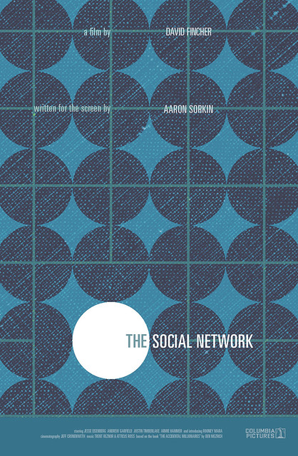
This movie already had a great poster, and while I found myself thinking of lots of great conceptual ideas for the story told in this movie, I couldn't figure out how to execute them. Meanwhile I'm looking at all of these Blue Note album covers and old Penguin covers that say so much with just an arrangement of shapes, and I wanted to try to see how far I could get with this film's themes: Design, communication, position, weight, strategy, connection, closeness, isolation, loneliness.

1 comment:
The thing to me is that you try to dig deep into the matter at hand, and have some sense of history. That is what I like about what you do. There is an implicit history of art and film in the images you come up with! Excellent, in my book!
Post a Comment