
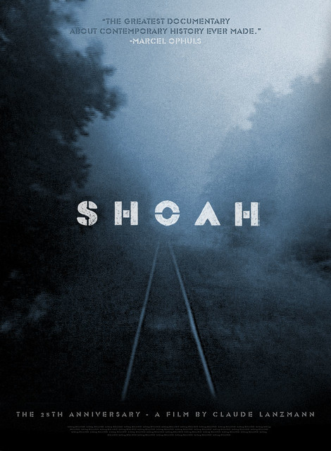
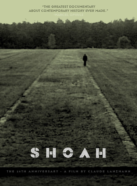
Here is a poster concept for SHOAH that we didn't end up using as the final one-sheet for IFCFilms. There were many, many striking images in Claude Lanzmann's 10-hour holocaust documentary, some more harrowing than others, but all of them beautiful in some way. It was very important to avoid presenting the film as a gloomy or morbid nightmare, because the film itself, difficult as it is to watch at times, is anything but. This was my favorite poster idea, and below is another. For the final poster, I gave a new treatment to an iconic image that was used in the original promotion of the film 25 years ago, both also seen below.
unused poster concept, 2010

original promotional poster, 1985
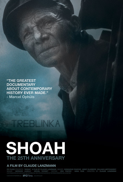
final theatrical poster design for IFCFilms, 2010
2 comments:
Great posters!
What is the font you used on the first two? Thanks.
Thanks Alec. The title treatment I made myself, inspired by the Glaser typeface, which I used in the billing and quote for these two comps.
Post a Comment