I recently discovered the art of
Tadanori Yokoo, only to learn that he's considered one of, if not
the most influential Japanese graphic designers of the 20th century. While his popularity in the 60's led to a lot of work providing psychedelic artwork for bands (including The Beatles), his primary medium seems to have been the poster, where his design and style just blows my mind. Each poster has its own complex layout and architecture, from his beautiful borders to the layered collages of images within the frame, ranging in scale from the miniature to the massive. Bright bold colors, but always within a decisive palette. A perfect integration of hand-drawn images and lettering and photographic images. Playfulness and beauty. I plan on stealing as much as humanly possible from this guy in the future.
There doesn't seem to be an affordable way to hang any Tadanori Yokoo posters on my wall, but I've ordered
this book on Amazon to study these designs and a prolific amount of others in greater depth. Thorough scavenging in bookstores around the world sometimes leads to a discovery of a cheap book of Yokoo posters, or, if you're lucky, a copy of "Waterfall Rapture: Postcards of Falling Water:" a photographic book devoted to Yokoo's personal collection of waterfall postcards. It might be my favorite book I own, and it deserves its own blog post.
I love everything Japanese, especially visual art and design, but Tadanori Yokoo just about takes the cake. And to make him even more of a badass in my mind, I just learned that he starred in
Nagisa Oshima's film Diary of a Shinjuku Thief. Check out
this blog post at 50 Watts (one of my very favorite art/design blogs on the internet) to learn a little more about Yokoo and see some additional images. Be sure to click on them and enlarge to appreciate the detail.


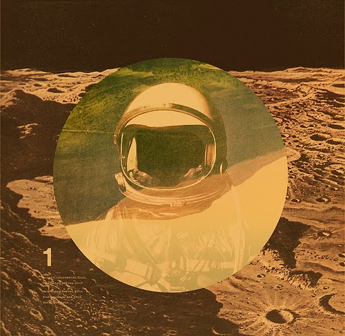
 Things I love about Mark Weaver: Found images. Square frames. Circles. Outer space. His ability to rebrand the Futura typeface for himself despite its having been branded before. Landscapes. Animal heads. Grids. That his images in sum create a world that is his own. A world conjuring the past and the future, memories, dreams and fears. MW has staked his claim as the proprietor of the modern digital collage, creating an iconic world that is aesthetically his and his alone. Mark Weaver's official site, flickr, twitter.