
Having just received my copy of The Criterion Collection's EVERLASTING MOMENTS, I thought I'd try my hand at a process post. I'm not sure how interesting this will be to anyone, but it's a nice way to look back at how I arrived at a final design, through sharing some of my abandoned and unused concepts. When I showed a couple people the final cover, they (aside from liking it) wondered what I really did other than taking an image and putting the title over it. Hopefully this post will show that a lot more went into it than just that, and that sometimes it takes a long journey before arriving at the simplest conclusion. This was definitely one of those cases.
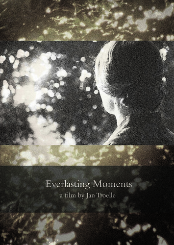
My first step in working on this project was to watch the film. I've tried designing poster art without having seen its film, and while this can often lead to interesting intuitive results, in this case as in most it was crucial for me to experience the film, get to know its characters and its world. It's a great film, and I immediately came to love its lead character, Maria Larsson. The story tells of a working-class woman in early-1900's-Sweden who turns to photography as a means of escape from a socially and emotionally humiliating relationship with her husband. I immediately checked out the existing posters for the film and was disappointed: the US poster while kind of appropriate in tone was just boring. And the foreign poster and DVD cover focuses on an image of Maria and her husband dancing happily together, with a colorful montage surrounding it: both tonally and thematically inappropriate to me:

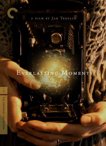
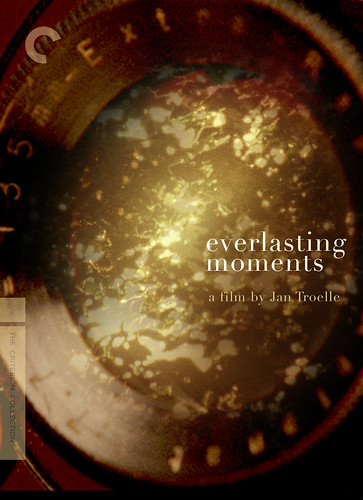
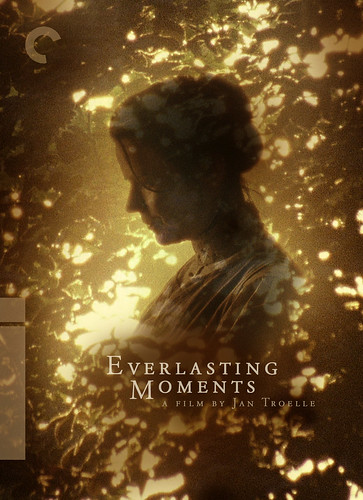
There was so much beautiful imagery in the film, I was both excited to dive in and also overwhelmed with where to begin. That guidance game in the form of a brief from my art director at Criterion, which involved focusing on two key images: a moth that is seen twice in the film-- as an illumination of the photographic process and as a symbol of Maria's inner self and ultimate freedom-- and the camera lens. I captured an image of the lens from the film and superimposed the moth inside the lens, signifying a moment, a truth, an image, immortalized through that lens. I also added a significant image seen late in the film that really resonated with me, that of light spilling through tree leaves.

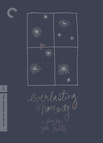
I had been listening to some Sigur Ros while working (the score in the film had a similar atmosphere, so I would work with this style of music playing), and in a moment of free-association I scribbled out the Sigur-Ros-style lettering treatment seen above. This image was the first that came to me, and I wanted to honor that, but it was all becoming quite abstract rather quickly, and with the title it was starting to look and feel more like a mid-90's acoustic-rock album cover, and less like the film itself. Getting out all the heebie-jeebies in this concept, I soon realized that this process would be one of simplification. So I pared down this concept and started playing with some very simple representations of the same idea:


Problem was, I didn't have a great, clear image of the camera lens in the film, especially one taken straight-on as seen in these images, which I made using found pictures of old similar lenses online. While I waited for some better screengrabs, I tried out some other concepts, like this one featuring Maria in a key scene late in the film. I had just seen a print of Tarkovsky's MIRROR which shares a very similar image, so maybe that's why I was fixated on this...

Tarkovsky's MIRROR
I loved highlighting that moment, but a) its a moment best discovered in the film itself, and b) there was so good layout to support this image that didn't involve the dreaded sectional bands so common in book covers and Hollywood movie posters (the problem of squeezing horizontal images-- inherent to movies-- into vertically-oriented poster/cover frames is an eternal one). Later, I ended up using this image as the booklet cover, and the light-through-the-trees inside the DVD case as well as for one of the menus.
I thought of using circular frames to suggest the camera lens, and I wanted to try incorporating Maria's face into the design, so I tried these concepts which also felt too book-cover-like:
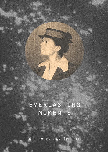

I had recently been doting upon the work of Mark Weaver, who uses a similar circular frame and bold colors in his layouts, and that's probably why I came up with the following character images, which really don't fit the mood of the film at all. This was one of the many moments in the process where I just had to try something completely different even if it was wrong. Not because I thought that these designs necessarily even had a chance, but rather because I needed to shed away some of the inappropriate ideas running through my head. Get them out of you and onto the computer, and your head will be freed up to discover the real solution. That's the idea, at least. I still like these, but I'm glad they're not involved in the final product as they really don't fit the natural look of the film, characterized by earthy, sepia tones rather than bold colors. The look of the film was something we wanted to pay respect to, but not oversell.

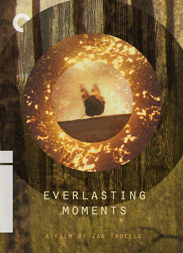
Going back to the initial moth and lens concept, we realized that we just didn't have the proper imagery to work with to execute that idea, so I tried another couple stabs at focusing on the camera lens with a different screenshot...
…then swerved back in the direction of Maria; at this point in the process, I had become quite attached to Maria (as you will be after seeing the film) and felt like she really should be on the cover. I tried a couple ideas including an image of her photograph in a frame…
… which we liked, but it looked too much like she had died… too morbid, too dark. I rather liked this image of Maria that could have possibly worked out had I not found a better solution:
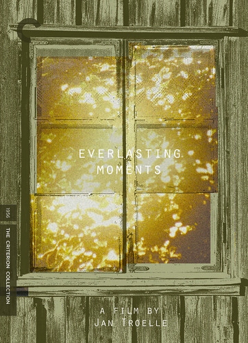
I was at a point now in the process where I was getting a little bit discouraged. I couldn't really deliver on the initial brief, not having the right imagery of the camera to really make it work. And having gone through several other ideas, the perfect solution hadn't yet revealed itself. So I started shaving off some more scattered concepts to rid myself of extraneous ideas and hopefully empty my creative cache. Another simplified circle-based cover, a more elaborate circular montage, a new image of an old window, an out-of-left-field hand-drawn doodle; with the idea that something might spark through this stream of scattered concepts... I even resorted to trying something with the aformentioned shot I disliked so much of Maria and her husband dancing in seemingly romantic bliss.

But these were all off the mark; too treated, too abstract. The dancing image was wrong, the drawing was just wrong, and I was stuck on this sans-serif typeface: also wrong. I was definitely scraping the bottom of the creative barrel.
My first step in working on this project was to watch the film. I've tried designing poster art without having seen its film, and while this can often lead to interesting intuitive results, in this case as in most it was crucial for me to experience the film, get to know its characters and its world. It's a great film, and I immediately came to love its lead character, Maria Larsson. The story tells of a working-class woman in early-1900's-Sweden who turns to photography as a means of escape from a socially and emotionally humiliating relationship with her husband. I immediately checked out the existing posters for the film and was disappointed: the US poster while kind of appropriate in tone was just boring. And the foreign poster and DVD cover focuses on an image of Maria and her husband dancing happily together, with a colorful montage surrounding it: both tonally and thematically inappropriate to me:
There was so much beautiful imagery in the film, I was both excited to dive in and also overwhelmed with where to begin. That guidance game in the form of a brief from my art director at Criterion, which involved focusing on two key images: a moth that is seen twice in the film-- as an illumination of the photographic process and as a symbol of Maria's inner self and ultimate freedom-- and the camera lens. I captured an image of the lens from the film and superimposed the moth inside the lens, signifying a moment, a truth, an image, immortalized through that lens. I also added a significant image seen late in the film that really resonated with me, that of light spilling through tree leaves.
I had been listening to some Sigur Ros while working (the score in the film had a similar atmosphere, so I would work with this style of music playing), and in a moment of free-association I scribbled out the Sigur-Ros-style lettering treatment seen above. This image was the first that came to me, and I wanted to honor that, but it was all becoming quite abstract rather quickly, and with the title it was starting to look and feel more like a mid-90's acoustic-rock album cover, and less like the film itself. Getting out all the heebie-jeebies in this concept, I soon realized that this process would be one of simplification. So I pared down this concept and started playing with some very simple representations of the same idea:
Problem was, I didn't have a great, clear image of the camera lens in the film, especially one taken straight-on as seen in these images, which I made using found pictures of old similar lenses online. While I waited for some better screengrabs, I tried out some other concepts, like this one featuring Maria in a key scene late in the film. I had just seen a print of Tarkovsky's MIRROR which shares a very similar image, so maybe that's why I was fixated on this...
Tarkovsky's MIRROR
I loved highlighting that moment, but a) its a moment best discovered in the film itself, and b) there was so good layout to support this image that didn't involve the dreaded sectional bands so common in book covers and Hollywood movie posters (the problem of squeezing horizontal images-- inherent to movies-- into vertically-oriented poster/cover frames is an eternal one). Later, I ended up using this image as the booklet cover, and the light-through-the-trees inside the DVD case as well as for one of the menus.
I thought of using circular frames to suggest the camera lens, and I wanted to try incorporating Maria's face into the design, so I tried these concepts which also felt too book-cover-like:
I had recently been doting upon the work of Mark Weaver, who uses a similar circular frame and bold colors in his layouts, and that's probably why I came up with the following character images, which really don't fit the mood of the film at all. This was one of the many moments in the process where I just had to try something completely different even if it was wrong. Not because I thought that these designs necessarily even had a chance, but rather because I needed to shed away some of the inappropriate ideas running through my head. Get them out of you and onto the computer, and your head will be freed up to discover the real solution. That's the idea, at least. I still like these, but I'm glad they're not involved in the final product as they really don't fit the natural look of the film, characterized by earthy, sepia tones rather than bold colors. The look of the film was something we wanted to pay respect to, but not oversell.
Going back to the initial moth and lens concept, we realized that we just didn't have the proper imagery to work with to execute that idea, so I tried another couple stabs at focusing on the camera lens with a different screenshot...
…then swerved back in the direction of Maria; at this point in the process, I had become quite attached to Maria (as you will be after seeing the film) and felt like she really should be on the cover. I tried a couple ideas including an image of her photograph in a frame…
… which we liked, but it looked too much like she had died… too morbid, too dark. I rather liked this image of Maria that could have possibly worked out had I not found a better solution:
I was at a point now in the process where I was getting a little bit discouraged. I couldn't really deliver on the initial brief, not having the right imagery of the camera to really make it work. And having gone through several other ideas, the perfect solution hadn't yet revealed itself. So I started shaving off some more scattered concepts to rid myself of extraneous ideas and hopefully empty my creative cache. Another simplified circle-based cover, a more elaborate circular montage, a new image of an old window, an out-of-left-field hand-drawn doodle; with the idea that something might spark through this stream of scattered concepts... I even resorted to trying something with the aformentioned shot I disliked so much of Maria and her husband dancing in seemingly romantic bliss.
But these were all off the mark; too treated, too abstract. The dancing image was wrong, the drawing was just wrong, and I was stuck on this sans-serif typeface: also wrong. I was definitely scraping the bottom of the creative barrel.
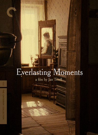
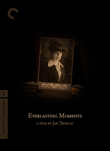
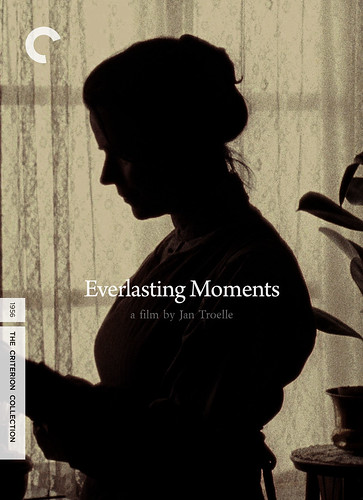
Just as the overall process seemed to involve a jockeying back and forth between new, out-of-the-box idea and simplified restarts, it was time to throw out everything I had and start back at the drawing board. My art director and I both liked a few of the things I had come up with, but nothing felt just perfect. We spent days emailing back and forth about what exactly we wanted to capture and convey with this cover and how to really pay tribute to the film, the story, the character, and we decided to start fresh and try to focus on the untreated imagery of the film itself, on a "moment" if you will. There are many "moments" in this film -- moments observed by Maria, captured by her with her camera, and moments captured by Troell, the director, as we watch Maria's story unfold. Thinking about this idea, my mind went rather quickly to one scene, one image from the film in which Maria has taken out her camera, still somewhat reluctant of this magical machine and her abilities with it, and goes to her window to photograph a passing parade. I found this screenshot from the film, which came back and struck me as if I were seeing it for the first time:
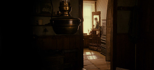
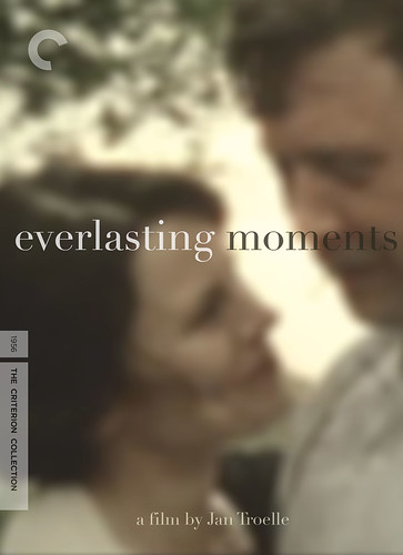
It seemed perfect: It's an image of Maria, of Maria watching the parade and holding the camera, and us watching her watch the parade. And we see her through a doorway, AND through a reflection in a mirror. The image, like the film, is ABOUT seeing, and specifically, about seeing this woman. I suggested it to my art director and she felt the same way. Suddenly, after all of those concepts, all of that struggle, the answer had just appeared, and it was settled. I played around with the layout-- having the doorframe divide the cover perpendicularly versus centering the doorframe-- then tried the few typefaces that I had narrowed down, and there was our cover.

Designing this cover was a massive learning experience. It was great to have the flexibility and room to play around with any idea that came to mind, and in doing so rid myself of the extraneous stuff that didn't fit. All of the designs that were over-treated or over-thought only led to another design that was inversely simplified and focused. Would I have even thought to use this image from the film to begin with, had I not gone through this roundabout process? Maybe not. I'm very proud of the finished product, I hope it does this beautiful film justice, and can't say enough about how great it was to with with the creative and thoughtful folks at Criterion who always prioritize the work of art above all. Everlasting Moments will be released on DVD and Blu-ray on June 29th, with some great supplements, an essay by Armond White, and menus and packaging designed by yours truly. I hope some of you will seek it out.
As always, thanks for reading.
It seemed perfect: It's an image of Maria, of Maria watching the parade and holding the camera, and us watching her watch the parade. And we see her through a doorway, AND through a reflection in a mirror. The image, like the film, is ABOUT seeing, and specifically, about seeing this woman. I suggested it to my art director and she felt the same way. Suddenly, after all of those concepts, all of that struggle, the answer had just appeared, and it was settled. I played around with the layout-- having the doorframe divide the cover perpendicularly versus centering the doorframe-- then tried the few typefaces that I had narrowed down, and there was our cover.
Designing this cover was a massive learning experience. It was great to have the flexibility and room to play around with any idea that came to mind, and in doing so rid myself of the extraneous stuff that didn't fit. All of the designs that were over-treated or over-thought only led to another design that was inversely simplified and focused. Would I have even thought to use this image from the film to begin with, had I not gone through this roundabout process? Maybe not. I'm very proud of the finished product, I hope it does this beautiful film justice, and can't say enough about how great it was to with with the creative and thoughtful folks at Criterion who always prioritize the work of art above all. Everlasting Moments will be released on DVD and Blu-ray on June 29th, with some great supplements, an essay by Armond White, and menus and packaging designed by yours truly. I hope some of you will seek it out.
As always, thanks for reading.
11 comments:
rad blog entry into the creative process!
Thanks man!
Insightful post, Sam, and a great look into your process. These things can be a pain to write. Keep it up!
Nice. I've been waiting for this post. Hoping to see one soon for House. If they didn't let you design it, that's down right criminal.
I'm here via Eric Skillman, and so excited to see more Criterion process posts! I hope you write more. I'm enjoying the rest of the blog as well.
Fantastic! Thanks for the glimpse into the process. More, please!
I'm not an artist, but I found this post fascinating. Hopefully you'll write some more about the process.
I really enjoy your writing. So inspiring. And your design for the cover is masterpiece. Even all the unused covers was wonderful as well.
Thank you everyone! I'll try to post about the HOUSE package design process as well soon...
Thank you for your post. I loved Everlasting Moments. I love your cover. When I saw your cover, I didn't fully appreciate it until after I had seen the film. It doesn't grab your attention, but it does have a mysterious allure once you give it a good look. I will probably buy this title at some point, and I will share a deeper connection with it knowing that your artistic process started with the same spark of admiration I had for this film. Thank you, Shawn McGuire
Thank YOU Shawn! Glad you loved the film.
Post a Comment